Best Cards: Wally Joyner
(This is Best Cards Ever, a never-ending quest to find the single best baseball card of every player.)
Wally World opened in 1986. Walley World, from the Vacation movie, debuted of course in 1983, but Wally World took another three years, until Wally Joyner debuted with the California Angels and set the league on fire for just a little while.
He was an All-Star (Wikipedia says he was the first rookie ever voted as an All-Star starter — I found that hard to believe, which is why I’m citing it like that instead of directly, but either way, he was good) and finished second in Rookie of the Year voting and eighth in MVP voting. Joyner didn’t keep up the momentum of his early career — he had another good season in his second year, but never made another All-Star team, and by the time he was 30 he was an average player.
After trying to figure out the best cards in the careers of Gary Carter and Kirby Puckett in the first two editions of this series, I thought I’d go down a tier with the third entry, picking out a good-not-great player, the kind of guy who had plenty of cards but far fewer truly notable ones like the Hall of Famers of the last two entries.
So today, in our quest to find the best baseball card in the history of every player, we dive into Wally Joyner.
Wally Joyner
Career: 1986-2001
WAR: 35.8
Hall of Fame: No, don’t rub it in
Joyner played 16 years. He had a career 117 OPS+. He played in the postseason four times, the World Series once. He got to return to his first team for his final season and got a standing ovation when announcing his retirement. No, he wasn’t a Hall of Famer — he didn’t even get a single vote for it when his turn came up — and ultimately he wasn’t even close. But that’s a heck of a resume nonetheless.
(As always, thanks to Check Out My Cards for being able to track these down.)
The worst Wally Joyner card
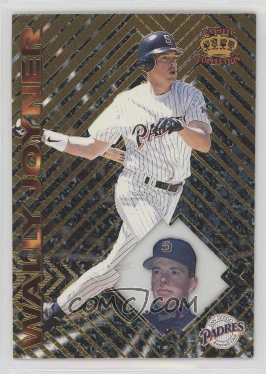
1997 Pacific Crown Collection #145
I love baseball. Despite the fact that I’m (I think) better at fantasy football playing, writing, and analysis, give me baseball every day of the week. But even those of us who are the most die-hard of fans have to admit that it’s often fundamentally a boring game. I’ll watch a game on TV any time, but I will literally never only watch the game. I’ll watch it while cleaning the room, or writing a story, or … just about anything, really. Baseball is great. Baseball is very often not that exciting.
In the 1990s, baseball card companies were bound and determined to pretend this wasn’t the case. Cards like Metal and Sportflics and Pacific Crown Collection and everything else tried to take everything boring about baseball, add a flashy background, and say “See! Baseball is exciting! There are gears and flames and stuff!” And I salute the effort, but that’s just not what baseball is.
This particular set was a blatant example of this. After the excitement of his rookie year, Joyner was a fundamentally boring ballplayer. This was a full decade removed from that, at which point he had moved on to perhaps the league’s most boring franchise with the league’s most boring color scheme. So we’re taking a bland ballplayer with a bland face (sorry, Wally) on a bland team, and splashing as many distracty bits as possible behind it. And to top it all off, good freakin’ luck reading his name if you don’t already know it.
Honorable mention
These aren’t the best of his cards. Sometimes they aren’t even that good. But they need to be mentioned one way or another.
2013 Panini America’s Pastime – America’s Best Autographs #AB-WJ
Panini had MLB licensing once upon a time, right? I could swear they did. But this card is just comical. From the airbrushed logos to the awkward photo to “California Baseball Club,” this is an image from a B-movie that didn’t even want to bother to get permission to use official names and identifies. Why are you even making unlicensed cards in 2013?
1993 Flair #218
2012 SP Signatures Collection #LAA1
So:
We couldn’t even get a picture on the card? It’s basically just writing on cardboard?
The dominant feature on the back of the card is the authentication, which, whatever.
LOL, they could only find two highlights, and one is that he led the league in sacrifice flies.
1998 Ultra #254
The question: Do you think the ball is in front of him, and he’s getting ready to field it? Or do you think he missed it and it’s already past him (maybe behind his leg?). My inclination is the former, but it could totally be the latter.
And now the observation: The fact that they had to split up “San” and “Diego” to accommodate the Y in his last name is the ugliest single piece of a card in a long dang time.
And now, the top four:
4. 2000 Fleer Tradition #409
I mentioned this on Twitter, but man, there were not many nice Wally Joyner cards. Maybe it was his inherent averageness, or maybe it was just bad luck for him, but ultimately he was just a dude on some cards. So that’s why one of his four best cards is here not for anything to do with him specifically, but because this was a particularly nice set. The Tradition set offered some excellent cards, with clean colors and paired pictures. Nothing remarkable, nothing flashy. Just a solid card set. For a player who lacked much else to hang his hat on, this qualifies.
3. 1991 Upper Deck Denny’s Grand Slam #23
Denny’s made cards for a few years there. You got them with a Grand Slam meal, they were this sort of hologram things, and as a kid, I could not possibly have loved them more. As a tie-in, the back of the cards listed how many career grand slams the players had. My dad was an equine veterinarian, which meant that he left the house super early in the mornings, and I was often his passenger. He had a client only a few miles from a Denny’s, so we’d stop there every so often to get Grand Slams and cards.
One year (I don’t think it was the 1991 cards, I think it was a few years later than that), Denny’s had promo materials set up in the restaurants for the cards. They featured a giant cardboard cutout of Tony Gwynn in the middle in front of a basebally background, with the cards mounted individually on either side of him and set on a battery to tilt back and forth. After staring at the promo on every visit we made to Denny’s for a while, I convinced my dad to try to buy it from them. The manager shrugged, said they were just gonna throw it away after the promo, and told dad we could just have it when they were done with it. That giant Tony Gwynn promo lived in my bedroom for far longer than I care to admit.
Anyway, this is a Wally Joyner card. It is a nice one. I probably like it more than you, for nostalgic reasons.
2. 2013 Panini USA Baseball Champions #5
What was Panini doing making those sad unlicensed cards in 2013 when they were also making these cool ones? Here, look back at the Olympic team from 30 years ago, with pictures of the players as young guys and no need to depressingly airbrush out logos or refer to teams as “California Baseball Club.” That’s what you want. Not that sad card from up above. This card’s great.
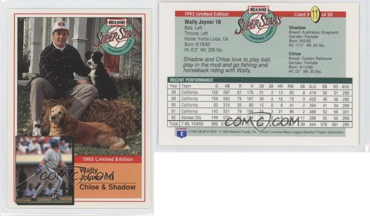
1. 1993 Milk-Bone Super Stars – Dog Food Issue #11
As mentioned above, ol’ Wally has about as boring an assortment of cards as any player with a decade-plus in the league could have. So absent any great shakes for him, card-wise, we say “Ooooh, doggos!” and note the Milk-Bone set that didn’t even have licensing (far less a sin in 1993 than in 2013) but gave names and bios on the players’ dogs. Growing up in a house with a bajillion dogs at any given time, I ended up with about 50 of each player in this set. Boring player. No logo. Rob Lowe-esque MLB-logo hat. But look! Pups!


